
Fintech App Design
Welcome to a world where finance meets technology in seamless harmony. Fintech App Design stands at the forefront of this dynamic union in our digital age, offering a gateway to innovative financial solutions.
In this article, we delve into the fundamental principles and best practices that underpin the creation of compelling and user-centric Fintech applications. Whether you’re building your first Fintech app or seeking to enhance an existing one, understanding the intricacies of design in the Fintech landscape is paramount.
Let’s explore the art and science of Financial Technology App Design together.
Key Takeaways
- This guide explores essential Fintech App Design best practices for startups in the USA, facilitating user trust and engagement.
- Visual appeal is vital as it captivates users, fosters a positive first impression, and encourages further interaction with the content or product.
- Testing and user feedback are crucial in the USA as they ensure user-centric design, regulatory compliance, and continuous improvement, ultimately enhancing user trust and satisfaction.
10 Fintech App Design Best Practices

Certainly, let’s delve deeper into the best practices for Financial Technology Design in the USA, specifically tailored for startups, along with practical examples:
1 – User-Centered Design
Best Practice:
Prioritize user needs and preferences throughout the design process. To better understand your target audience, conduct user research.
Practical Example:
Use personas based on user research to create tailored user journeys. For instance, if you discover that a significant portion of your users is concerned about security, emphasize strong authentication methods and encryption in your app.
2 – Minimalistic and Intuitive Interface
Best Practice:
Keep the app interface clean and free from unnecessary clutter. Use intuitive design elements.
Practical Example:
PayPal’s mobile app is an excellent example of a clean and intuitive interface. It offers a straightforward process for sending and receiving money with minimal distractions.
3 – Mobile-First Design
Best Practice:
Given the high mobile device usage in the USA, prioritize mobile design and ensure responsive layouts.
Practical Example:
Venmo’s mobile app is designed with a focus on mobile users, allowing them to make payments, split bills, and even engage in social interactions related to transactions.
4 – Strong Visual Hierarchy
Best Practice:
Use typography, color, and contrast to create a clear visual hierarchy. Important information should stand out.
Practical Example:
The Robinhood app uses green and red colors to indicate positive and negative changes in stock prices, making it easy for users to identify important financial data at a glance.
5 – Streamlined Onboarding
Best Practice:
Make the onboarding process as smooth as possible to reduce friction for new users.
Practical Example:
The Chime banking app offers a quick and easy onboarding process that allows users to set up an account and access essential banking features in minutes.
6 – Security and Trust Signals
Best Practice:
Clearly communicate security measures and build trust through design. Use lock icons, encryption symbols, and clear privacy policies.
Practical Example:
The Coinbase app displays a lock icon to indicate secure transactions and offers two-factor authentication to enhance user confidence in handling cryptocurrencies.
7 – Personalization and Recommendations
Best Practice:
Leverage user data to provide personalized financial insights and recommendations.
Practical Example:
Mint, a budgeting app, offers personalized spending insights and budgeting tips based on a user’s financial transactions and goals.
8 – Accessibility
Best Practice:
Ensure your app is accessible to users with disabilities by following WCAG guidelines.
Practical Example:
The Ally Bank app includes features like voice-guided navigation for visually impaired users, making banking accessible to a wider audience.
9 – Continuous Testing and Improvement
Best Practice:
Regularly gather user feedback and conduct usability testing to identify areas for improvement.
Practical Example:
The Cash App by Square frequently updates its app based on user feedback, enhancing the user experience and adding new features.
10 – Compliance and Regulation
Best Practice:
Stay up-to-date with financial regulations in the USA and ensure your app complies with them.
Practical Example:
Robinhood strongly emphasizes regulatory compliance by providing educational materials and disclosures to users about investing risks.
You can develop a dependable and user-friendly financial app that caters to the needs of your target market while upholding the highest design and security standards by adopting these best practices into your financial technology design in the USA.
Importance of Visual Appeal
Visual appeal is pivotal in Fintech App Design, influencing user engagement, trust, and overall success. Here’s an elaboration on its importance and the key factors:
Color Schemes:

Importance:
Color schemes evoke emotions and convey brand identity. In Fintech, colors should instill confidence, trust, and a sense of security.
For instance, blue and green hues are often associated with trustworthiness and growth. PayPal uses a blue palette, promoting confidence in secure transactions.
However, color choices should align with the brand’s personality and resonate with the target audience.
Typography:
Importance:
Typography influences readability, user comprehension, and brand consistency. Clear and well-chosen fonts enhance user experience.
Fintech apps should prioritize legibility, opting for clean, sans-serif fonts for body text. For headings and branding, distinctive fonts can reinforce identity.
Mint, for example, uses a combination of clean, readable fonts for transaction details and a unique font for its logo, creating a balance between professionalism and individuality.
The overall visual design sets the tone for the user’s experience. A well-designed app fosters trust and encourages users to explore its features.
Consider the balance between a minimalist design that portrays simplicity and a comprehensive design that conveys a wealth of information.
PayPal, with its clean and organized layout, exemplifies a balance that is both visually appealing and informative. Clutter-free screens and well-defined elements guide users seamlessly through the app.
In summary, visual appeal in Fintech App Design is essential as it can significantly impact user engagement and trust. The careful selection of color schemes, typography, and overall graphic design should align with the brand’s image and the user’s emotional response.
A visually appealing Fintech app enhances usability and communicates reliability and professionalism, ultimately contributing to the app’s success in a competitive market.
Importance of Testing and User Feedback In USA
Assuring that the application satisfies the highest standards of usability, security, and user happiness requires testing and user input. Fintech App Design in the USA.
Iterative Testing:

Iterative testing is the process of repeatedly evaluating and refining your fintech app’s design and functionality throughout its development. Here’s why it’s vital:
Enhanced User Experience:
Early in the design process, you may find and fix usability problems thanks to iterative testing. This leads to a more user-friendly experience, reducing frustration and increasing engagement.
Optimized Features:
Regular testing helps you fine-tune features and functionalities based on real user input. You can prioritize improvements that matter most to users, ensuring that the app meets their needs.
Risk Mitigation:
Detecting and rectifying design flaws or security vulnerabilities in the early stages prevents costly fixes and potential data breaches down the line.
Competitive Advantage:
Continuous testing enables you to stay ahead of the competition by swiftly adapting to changing user preferences and market trends.
Compliance and Trust:
It helps ensure the app complies with evolving financial regulations, contributing to user trust.
Example:
A fintech app conducts iterative testing and discovers users find the onboarding process confusing. Based on this feedback, the design team simplifies the process and observes improved user engagement and fewer drop-offs.
User Feedback:

Gathering feedback from actual users is invaluable for shaping your fintech app’s design. Here’s why user feedback is crucial:
User-Centric Design:
Feedback provides insights into user expectations and pain points, guiding the design toward a user-centric approach.
Validation of Assumptions:
User feedback validates or challenges your design assumptions, helping you make data-driven decisions.
Identifying Issues:
Users can pinpoint issues that may not be apparent to the design team, such as confusing navigation or unclear instructions.
Prioritizing Enhancements:
Feedback helps prioritize design changes and new features based on what users find most valuable.
Enhanced Trust:
Addressing user concerns and suggestions demonstrates a commitment to user satisfaction, fostering trust in your app.
Example:
After the launch of a FinTech app, users provide feedback about difficulties in accessing transaction history. The app’s development team responds by redesigning the navigation and improving user satisfaction and engagement.
In summary, iterative testing and gathering user feedback are integral to the success of Fintech App Design in the USA. These processes ensure that the app aligns with user needs, adheres to regulatory standards, and offers a seamless and secure financial experience, ultimately leading to higher user adoption and trust in a competitive fintech landscape.
Tools Used For Fintech App Design
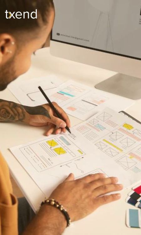
When designing Fintech apps in the USA, several tools and software are commonly used to streamline the design and development process. Here are some key tools that can be employed:
1 – Sketch:
Sketch is a popular vector-based design tool used by many designers for creating user interfaces and prototypes. It includes a variety of modules and connections that are particularly helpful for developing finance apps.
2 – Adobe XD:
Adobe XD is a powerful design and prototyping tool widely used in the industry. It provides collaboration tools for group projects and enables designers to produce interactive prototypes.
3 – Figma:
Figma is a web-based design tool known for its real-time collaboration capabilities. Because several team members may work on a project at once, it’s a fantastic option for financial app design teams.
4 – InVision:
A prototyping tool called InVision enables designers to make animated and interactive prototypes. It’s useful for user testing and gathering feedback on the app’s design and functionality.
5 – Axure RP:
Axure RP is a prototyping tool that is particularly suited for complex fintech applications. It allows for advanced interactions and dynamic content creation.
6 – Adobe Illustrator:
While primarily used for vector graphics, Adobe Illustrator can be handy for creating custom icons and detailed graphical elements within the app’s design.
7 – Zeplin:
Zeplin is a collaboration tool that helps bridge the gap between designers and developers. It allows designers to share design specs, assets, and style guides with developers, ensuring a seamless handoff.
8 – Abstract:
Abstract is a version control and collaboration tool designed for design teams. It helps keep track of design changes and enables designers to work together efficiently.
9 – Proto.io:
Proto.io is a web-based prototyping tool that allows designers to easily create interactive prototypes. It’s useful for testing different user flows and interactions in fintech apps.
10 – Marvel:
Marvel is a user-friendly prototyping tool often chosen for its simplicity. It’s suitable for creating basic prototypes and conducting user testing.
Sketch, Figma, and Adobe XD plugins:
These design tools often support various plugins that can enhance the fintech app design process. Plugins like ‘Anima’ for Sketch or ‘Zeplin’ for Figma, and Adobe XD can be invaluable for design handoffs and code generation.
User Testing Platforms:
Fintech app prototypes can be subjected to user testing using programmes like UserTesting or UserZoom, which can help gain insightful feedback for improving the design.
Collaboration and Communication Tools:
Beyond design-specific tools, collaboration and communication platforms like Slack, Microsoft Teams, or Trello can be instrumental in coordinating efforts among design teams, developers, and stakeholders.
It’s essential to choose the right combination of tools based on your team’s preferences and the specific requirements of your fintech app project. These tools can significantly improve collaboration, efficiency, and the overall quality of the design process, ensuring that your FinTech app meets the highest standards of usability and functionality.
Frequently Asked Questions
Depending on complexity, the cost of designing a fintech app varies widely, typically from $20,000 to $200,000 or more.
Design is crucial for user trust, engagement, and usability in fintech apps, impacting adoption and customer satisfaction.
Conclusion
In conclusion, effective fintech app design, guided by key principles and best practices, is pivotal for user engagement and success in the ever-evolving financial technology landscape.
Incorporating these principles, along with an emphasis on typography and user-centricity, ensures that fintech apps are functional, user-friendly, and visually appealing. Maintaining a competitive advantage in the fintech sector requires keeping up with the most recent design trends and user feedback as technology and user preferences change.
By adhering to these principles, fintech app designers can create intuitive, secure, and customer-centric experiences that cater to users’ needs in the USA and beyond.
